
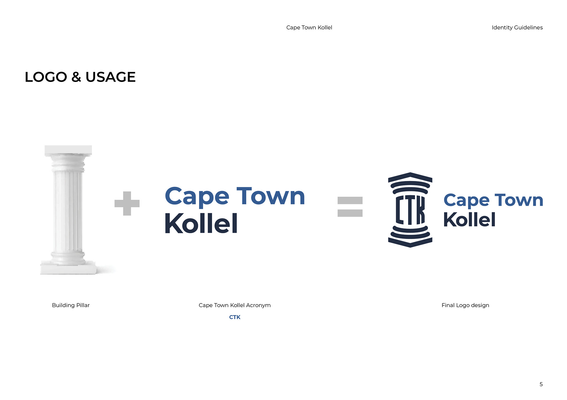
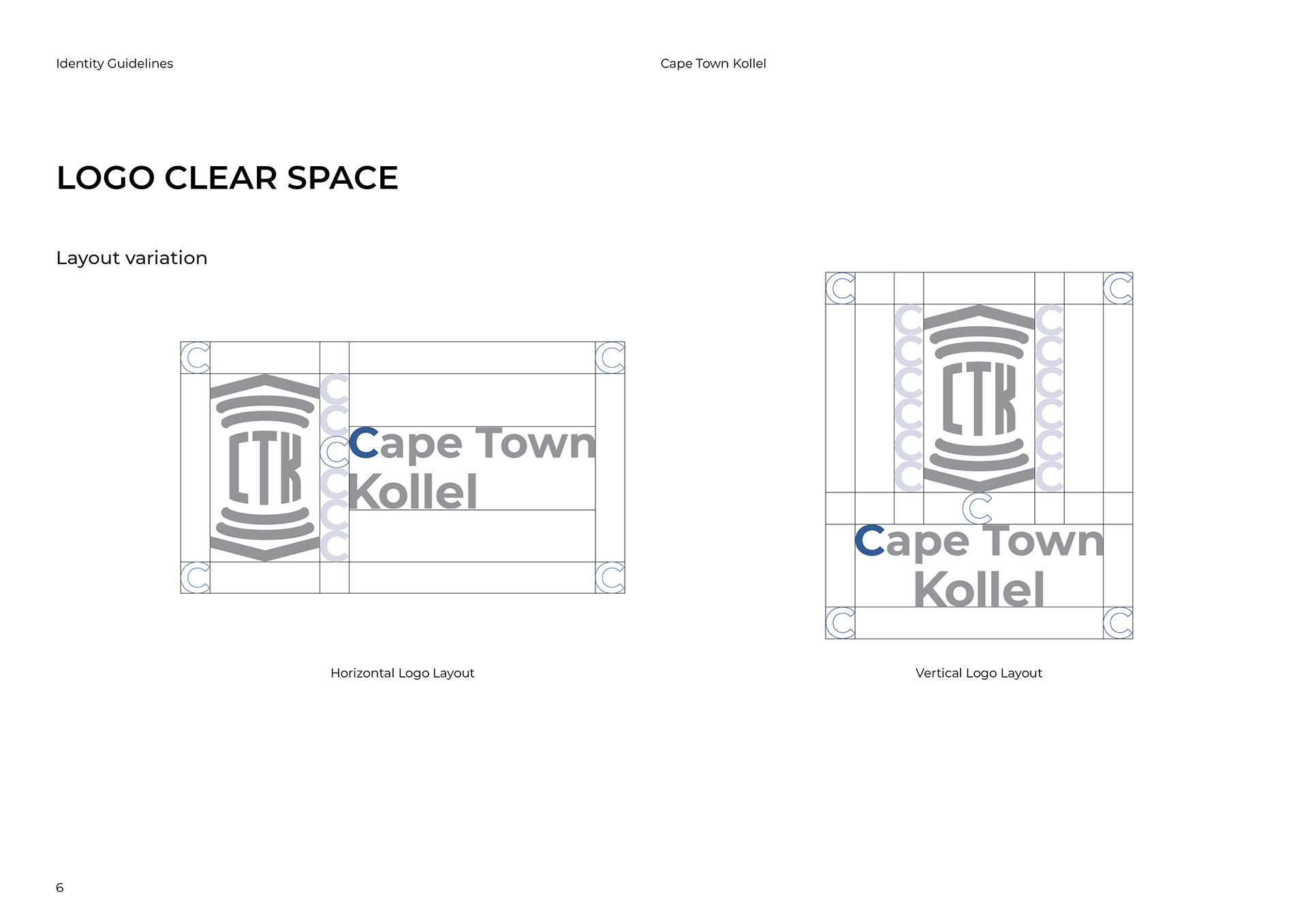


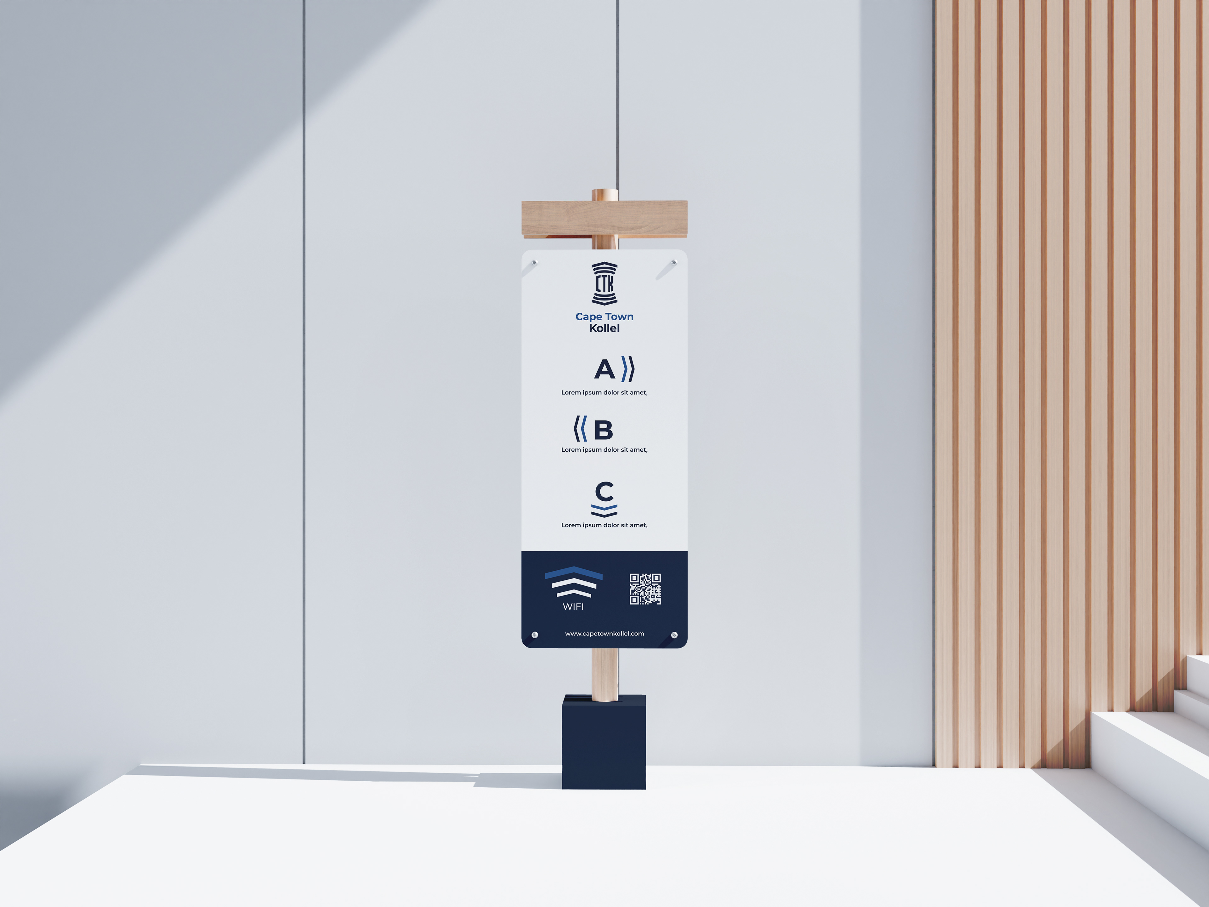


A refined and structured visual identity system developed for the Cape Town Kollel. The branding reflects tradition, strength, and clarity—anchored by a logo inspired by classical pillars, a dignified type system, and a calming blue-toned color palette. This guide outlines logo usage, spacing, typography (including Hebrew integration), and color specifications—ensuring consistent communication across all platforms and touchpoints.